Tuesday, 18 September 2012

My last post highlighted the increasing ability to manipulate and construct our physical bodies...to become our own architects. As I mentioned, the French perfromance artist, Orlan explores these ideas in an extreme manor by using her own body to question body conventions. During the 1990's Orlan underwent a series of cosmetic surgeries to transform her face. In her postmodern approach to aesthetic, Orlan chose to rebuild her face by replicating the body parts of five women; chosen for the mythology surrounding them. The hybrid result was made using the chin of Botticelli's Venus Goddess, the forehead of Leonardo's Mona Lisa, the mouth of Boucher's Rape of Europe, the eyes of jean-leon gerome's psyche and the nose of a statue of Diana. Orlan explained that 'I tried to use surgery not to better myself or become a younger version of myself, but to work on the concept of image and surgery the other way round. She described her work as 'Carnal Art' which was 'not against cosmetic surgery, but rather against the conventions carried out by it' and 'the dominant ideology that impresses itself more and more on feminine...flesh. ' Orlan's work demonstrates a drastic representation of how we are able to completely reconstruct ourselves. 

'Reincarnation of Orlan'

Manipulating the face through the use of temporary, external structures has also been analysed by a variety of contemporary artists and designers. It draws on ideas surrounding the boundary between the body and objects and their ability to distort that boundary. 
Left to Right: Lucy McRae, Burcu Buyukunal, Imme van der Haak


Lucy Mcrae has become increasingly well known in contemporary practice, referring to herself as a body architect. Having trained as a ballet dancer and studied architecture and fashion, McRae developed a profound interest in the human body. Her work presents an investigation into the way technology can merge with biology in our own bodies. In reference to her more spontaneous creations McRae explained that she became 'obsessed with this idea of blurring the perimeter of the body, so you couldn't see where the skin ended and the near environment started'; effectively altering the silhouette of the body. It's common for fashion to play with the human silhouette but I think it is interestingly seen less in everyday jewellery...does jewellery need to be large in scale to manipulate the human silhouette? The images below exemplify ways in which the body's boundary can be manipulated.

Left to Right: Gregoire Alexandre, Lucy McRae


Victor & Rolf Blue wedge Tulle dress photographed by Gregoire Alexandre


Structures can be used to  analyse the spaces between the body  and structures can physically manipulate the shape of the body.
L to R: Maurice Seymour, Gregoire Alexandre.

My last post also featured the work of Rebecca Horn, whose oeuvre heavily centres around the human body. Horn's surreal constructions question the boundary between our physical bodies and our inner selves, as well as the 'reciprocal relationship between self and context.' Her finger gloves created an extension that simultaneously enhanced her ability to touch whilst distancing the rest of her body from the surrounding space. The piece below demonstrates the the more intimate connection between body and self. The woven tube extends from the mouth which then divides to cover both breasts, creating a triangular shape, as 'one's perception expands triangularly'. Many of Horn's pieces incorporate feathers or wings which she consciously uses to create a 'tactile extension of the outer skin'. Horn's constructed objects don't simply sit on the body, they use it to question the perceptions and limitations of it. 


Rebecca Horn, 'Cornucopia, Seance for Two Breasts' 1970


Salvador Dali by Richard Avedon

Friday, 14 September 2012


I recently visited the Superhuman exhibition at the Wellcome Collection. It displayed a variety of objects and films, demonstrating how we have used technology and biology to enhance our lives...for centuries. Seemingly ordinary objects such as glasses, lipstick and an iphone were reminders that our lives are enhanced on a daily basis.

As we become more exposed to the 'rapid developments in areas such as nanotechnology, biotechnology and cognitive science' we are being increasingly confronted by the social and moral implications that they bring.This debate is highlighted at the beginning of the exhibition, through the story of Icarus. It reminds us that in our attempt to enhance ourselves we should also be aware of when to stop....Icarus flew too close to the sun, melting the wax that held his feather wings together. 

 The use of enhancement to 'normalize' the body appeared quite frequently, highlighting the impacts of societal demands on our development. A short film displayed the making of a glass eye, a protheses that 'completes' the body but cannot replace its function. An example of protheses that did try to encourage 'normal' functioning however, were the complex protheses made for the children affected by the thalidomide disaster. The artificial legs ans arms however, proved to hinder normal function rather than assist it. Many children preferred to adapt to their own bodies rather than adapting to social norms; demanding that society accepted them for who they were. 


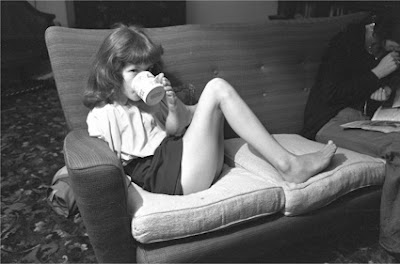
Philippa Verney Drinking Coffee with her Foot. Photograph by Frank Hermann 

I found it interesting to read the comments made by Aimee Mullins, a double amputee, paralympian and model. She was featured in Matthew Barney's Cremaster 3 film, which was on display in the exhibition. Mullins explained that society has progressed from the idea of trying to normalise the body and now considers the broader idea of augmentation and potential. Protheses are no longer seen as something to replace loss, rather that they 'stand as a symbol that the wearer has the power to create whatever it is that they want to create in that space, so that people society once considered to be disabled can now become the architects of their own bodies.' This notion of controlling the design of your body appearance links to the increasingly common act of cosmetic surgery. This was also discussed in the exhibition, in a film called 'Cut through the line' by Regina José Galindo, 2005. The increasing use of surgery to to achieve aesthetic perfection has allowed us to 'restructure our bodies to satisfy our own, or society's expectations.'

The exhibition also presented artistic interpretations of body enhancement, albeit cosmetic surgery could be considered art in the light of the performance artist Orlan. On display were items such as Vivienne Westwood's ghillie shoes and Rebecca Horn's material finger extensions titled 'Scratching both walls at once' 1974-75. The supporting words explained that Horn's 'delicate yet unsettling constructions extend the body, changing the relationship between the wearer and surrounding space.' The extension becomes a form of enhancement in that it brings things closer into touch. It increases the body's corporeal boundary and activates the space within it. The ability to move the extensions also serves to define and blur the boundary between the body and space. Horn uses many mediums to analyse the equilibrium between body and space/ object and space, such as spatial installations, sculpture and performance. Her early body extensions focus on the human in space, and her later works look at replacing the body with kinetic sculptures. More recently, Horn's work uses mirror reflections, light and music to define and cut through spaces. Westwood and Horn have interestingly both presented the idea of enhancement through extension, Westwood's 10 inch shoes highlight the hindrance this can cause.


Rebecca Horn, Scratching Both Walls at Once, 1974-1975

Rebecca Horn, Scratching Both Walls at Once.
Naomi Campbell falls in Westwood's 10 inch heel Ghillie shoes s/s 1993 catwalk

Emily Sargent, the curator,  explained that the range of objects in the exhibition were markers that enhancement should not viewed as an infringement on our 'core values' it is in fact 'our very desire to improve ourselves that makes us human'.


Monday, 3 September 2012

Around this time last year I was part of a group chosen by the V&A to design and create a brooch, in response to the up and coming postmodernism exhibition. This premiere exhibition was to be displayed in the V&A from the 24th September- 15th January 2012. My previous post reminded me of this, as a key aspect of the postmodern movement, 1970-1990, was the cutting and pasting of different artistic disciplines. Although the movement is infamously hard to define, it ultimately presented an explosive reaction to the modernist ideals set out by groups such as the Bauhaus. The postmodernists were interested in ambiguity, decoration, intertextuality and mediation '(the reproduction and even selling of things, not just the making of things)'. A principle aspect of the movement was 'historic quotation' refferring to ideas of intertexulaity whereby the postmodern 'author' blends past and current texts. However, this was not intended to construct meaningful statements, they simply found pleasure in seeing how it all fit together. They focused on the surface, the facade, of things and valued concrete experience over abstract principles. However, the movements paradoxical existence is highlighted when their objects become fixed and interpreted, as they simply become another form of modernism. Postmodernism cannot, on its own principles, ultimately justify itself. An essential metaphor of the postmodern movement was the 'Hall of mirrors' as images were bounced from one surface to another, denying the possibility to discern meaning or location. 
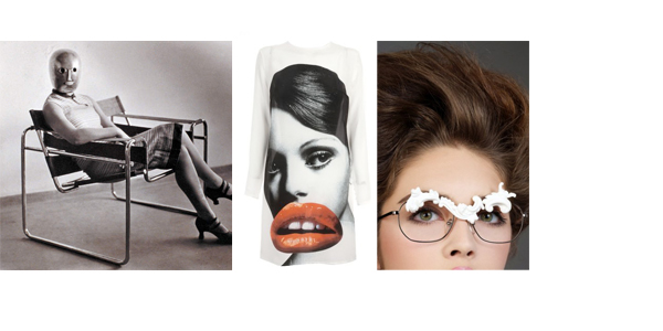
Left to right: Alessandro Mendini 'Proust chair' 1978; Otto Kunzli 'Brooch' 1983;Wet magazine, April Greiman and Jayme Odgers- No. 20 1979

The more I researched this movement, the more confused I became. So I decided to take the starting point, for my brooch, from something that sparked my attention during in the lecture given to us by Glenn Adamson's, co-curator of the exhibition, at the beginning of the project. He explained that the idea of attacking what had come before was the first expression of postmodernism, and was clearly expressed by Alessandro Mendini. Mendini was a radical Italian designer and magazine editor. In 1974 he created a piece called the 'Destruction of the Lassù chair'. This involved the construction and deconstruction of the 'ideal' chair. The very simple chair, a symbol of the perfect object, was placed on the top of a series of steps and set on fire. 

Alessandro Mendini 'Destruction of the Lassù chair' 1974

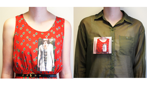
Although this destruction of the 'ideal' effectively announced a new approach to design, I was particularly interested in how the end result existed as an image rather than a product. The image ultimately became the end product, a product that could be quickly and cheaply reproduced.I consequently decided to create photographic brooch that existed purely as an image rather than a 3D object; referencing the postmodern interest in mixing disciplines. I also intended to reference their  interests in intertextuality, production, process and facade. I began with a photograph of a previous piece of work I had made, immediately referencing the past. I added a a paperclip attachment to this photograph in order to photograph it as a brooch on someone else. The resultant photograph was then pinned and photographed on someone else. This infinite process of reproduction served to personalise the act of mass production, as the original image becomes more unique as it reproduced. The photographic format of the series also created a piece that simultaneously quotes the past and present in one image. Each photograph in the series was taken of the upper torso, commenting on the increasing formation of 'faceless' connections and the varying facades that exist in our new global society. My brooch ultimately sought to combine postmodern concerns with contemporary society. 

The beginning two images from the 'infinitely' long series. Attached to the clothing with a paper clip turned pin.  
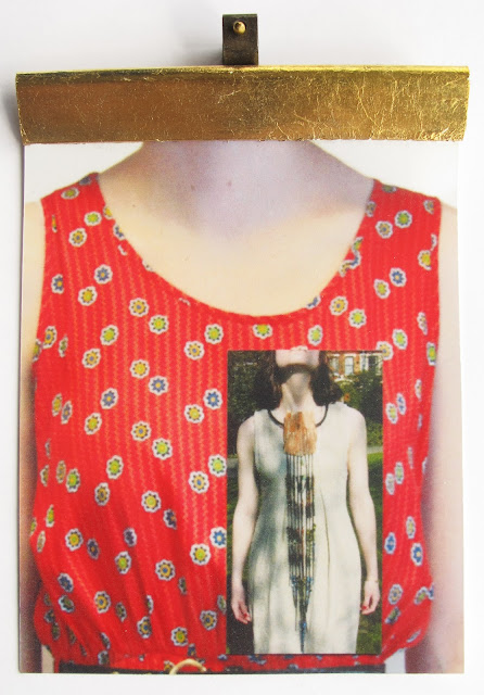
Developed idea after working with the V&A- Changed attachment: picture hook and self made pin  attached to a plastic poster clip coated in gold leaf. The hook references the re-appropriation of objects; the wearer acts as a wall. The gold lead poster clip creates an ephemeral coating that will soon revela the underlying plastic; referencing the temporary state of postmodernism.

Although the impact of postmodernism lost momentum during the 1990's, it is still relevant today as ideas surrounding intertextuality and reproduction are still analysed. This can also be said about the Bauhaus group, which it paradoxically reacted against. The Bauhaus group introduced a new way of working that remains present in art education today. They encouraged the cross contamination of disciplines, and developed an alternative way of viewing materials, colour and form.

I think working closely with other disciplines helps to highlight an question the limitations of each area. During my foundation I specialised in fine art sculpture. I was conscious of creating work that encouraged interaction from the viewer, enticing them to walk round it and become encapsulated by it. The image below is a piece from my final collection, made of aluminium and wood. Although the photo doesn't show the full sculpture, it expresses the merging between sculpture and....jewellery. Questioning the boundary between the two disciplines, if a piece can be worn in some way does that make it jewellery? 


Sunday, 2 September 2012

For a short time in July, 6-29th, the V&A displayed a small exhibition titled 'Britain Creates 2012: Fashion + Ar Collusion'; commissioned as part of the London 2012 Festival. It featured nine parings of fashion designers and visual artists who each created a collaborative piece of work. It was 'an opportunity to acknowledge and promote the long-lasting relationship between fashion and art'. Each collaboration strived to merge the creative heads of the artist/designer...becoming dartists! A piece that particularly stood out was the only wearable piece in the exhibition, by Giles Deacon and Jeremy Deller. Deacon is known for his playful approach to clothing, whilst Deller is a video and installation artist who is concerned with taking his work beyond the gallery walls into everyday life. The pair were united by the idea of 'art for all', a principle promoted by William Morris and the Arts and Crafts movement. The print design that covered the full-body running suit and flowing train was resultantly inspired by a William Morris stained glass window. I think Deacon and Deller's piece has successfully connected a variety of disciplines. It has progressed from a delicate and dynamic piece of craft-work to a digitally manipulated image through to a strikingly dynamic piece of clothing. The mixing and merging of mediums was a significant principle in the postmodern movement 1970 to 1990. However, this aesthetic is still very much visible in current creative expressions; exemplified by this exhibition. Postmodernism offered an explosive reaction to the modernist ideals in art and design represented by groups such as the Bauhaus. However, the Bauhaus movement also sought to blur the line between disciplines, and created a united workshop environment that is seen in creative education today. 


Stained glass window of King Arthur and Sir Lancelot, by William Morris

Giles Deacon + Jeremy Deller
'Untitled'
2012

Deller described the final piece as an 'Arts and Crafts suit of armour for an athlete'. The artists subsequently planned to incorporate their design in this summer's olympics by printing it on marathon blankets and other items to be handed out to runners and spectators. This effectively expands on the artists original intentions of creating art for all! 


Left to Right: Giles Deacon and Jeremy Deller


Another piece that caught my attention was a large, textured inkjet print by Matthew Williamson and Matt Collishaw. Williamson is a British fashion designer whose signature aesthetic is defined by bright and intricately detailed pieces. Collishaw is a London based artist who uses photography and film to explore   ideas of illusion and desire, questioning the notion of everyday conventions. The collaborative piece has used one of Collishaw's butterfly artworks as the basis. His large prints have been created by crushing the wings and body part of a dead butterfly between the glass plates of a 35mm slide. The crumbling result is then scanned and moved around on photoshop. The art critic Ben Lewis described them as C19th science meets C21st technology. Williamson reacted to the print by highlighting the iridescent scales and recreating the crumbling texture of the crushed butterfly. He used a bright and delicate arrangement of sequins and stones to create areas of varying relief. The overall piece, made a striking impact in the exhibition, which measured over 2 metres in width. The adorned butterfly lured you in to analyse its abstract beauty...the beauty of death. 

Matthew Williamson + Mat Collishaw
'Lepiszoulo'
2012


Close up of 'Lepiszoulo' 
showing the Williamson's sequined relief (approx 1.5cm)  applied to Collishaw's butterfly inkjet print


Left to Right: Matthew Williamson and Mat Collishaw


As 'touristy' as it sounds, I couldn't visit Barcelona without taking a two hour train up the coastline to Figueres, the birth place of Salvador Dalí....and the location of his own museum 'Theatré-Museu Dalí'. The museum dominates part of the old town with large titled eggs and a protruding glass dome.


The museum had two main sections, designed by Dalí to be as much an art piece as the work it contained. The first section incorporated a central courtyard with gold manequins looking down at you from every window. The maze of corridors and rooms that surrounded the courtyard, immersed you further into Dali's surreal world.


The Mae West room.
After walking around the seemingly disjointed display of  facial objects,  a narrow stairs led you up to a large magnifying glass...revealing the face of Mae West.
The Mae West Lips sofa, designed by Dali in 1937.


The second part to the museum was titled Dalí·Joies and exhibited his sparkling jewellery designs. Dali explained that 'Anthropomorphic subjects appear and reappear in my jewels. I see the human form in tress, leaves, animals.'


"Without an audience, without the presence of spectators, these jewels would not fulfil the function for which they came into being. The viewer, is then the ultimate artist." Dali 1959


I also visited Barcelona this summer....


All these photos were taken at Antonio Gaudi's El Parc Güell. Despite it being a tourist hotspot, it was still intriguing to stroll around the curving paths and wonder in and out of his naturalistic and surreal creations.


Another Gaudi creation that was hard to miss was the Casa Milà, more popularly known as 
 La Pedrera (the stone quarry) as the façade was intended to resemble an open quarry. The apartment house was commissioned to Gaudi by the industrialist Pere Milà and his wife Roser Segimon and took seven years to build, 1905-1912. It featured many of Gaudi's renowned design elements, including the single undulating façade, organically shaped wrought ironwork and natural forms coated in broken pieces of ceramics. The use of ceramics was termed trencadís in Catalan Modernism, which involved creating mosaics from broken pieces of tile and dinnerware. Gaudi offered a slightly alternative approach to this technique by covering architectural structures in brightly coloured shards of ceramic.


White pieces of ceramic often came from broken cups and plates disregarded by Spanish manufacturers. Gaudi had utilised the neutral colour to cover large, twisting structures that greeted you when walking out on to the top of the La Pedrera...as well as being visible form the streets below. Up close however, it was interesting to see that some of the pieces appeared to have melted and pitted under the intense sun.  


Other chimney forms were ingrained with a mosaic of broken glass bottles. 


The inside of the building presented a selection of rooms that had been kept in the style of the early C20th living. Other rooms and corridors exhibited examples of natural objects that inspired Gaudi's designs, alongside his architectural models. A display that particularly stood out was a suspended chain model that revealed Gaudi's design for the church at the Güell colony, it was titled Estereo Funicular. The display was mesmerising in the way that the reflection offered clarity and structure to the hanging form.


One of the aspects of Guadi's work that I found most intriguing was the way he interpreted natural forms in an intriguingly surreal style. The pieces he designed inhabited a new form of life. 


Wednesday, 22 August 2012

Continuing the wood theme...at this year's Treasure exhibition, held in Somerset House, I discovered the work of Diane Turner. The South African jeweller combines sculpted wood with gold and silver plating. Turner explained that the crater shown in the piece below was hidden within a piece of wood that she bought and was only discovered upon slicing and shaping it. She subsequently incorporated it into the design by plating it in the same metal that encases the geometric 'tree'. I think Turner's use of wood and metal presents an interesting example of how wood can be used in contemporary jewellery. 


Weird, woody forms also appeared on the beach in Southwold I visited this summer...


There were a few other intriguing sights along the Suffolk coastline...the power of weather to manipulate and form our landscapes and nature has always fascinated me.